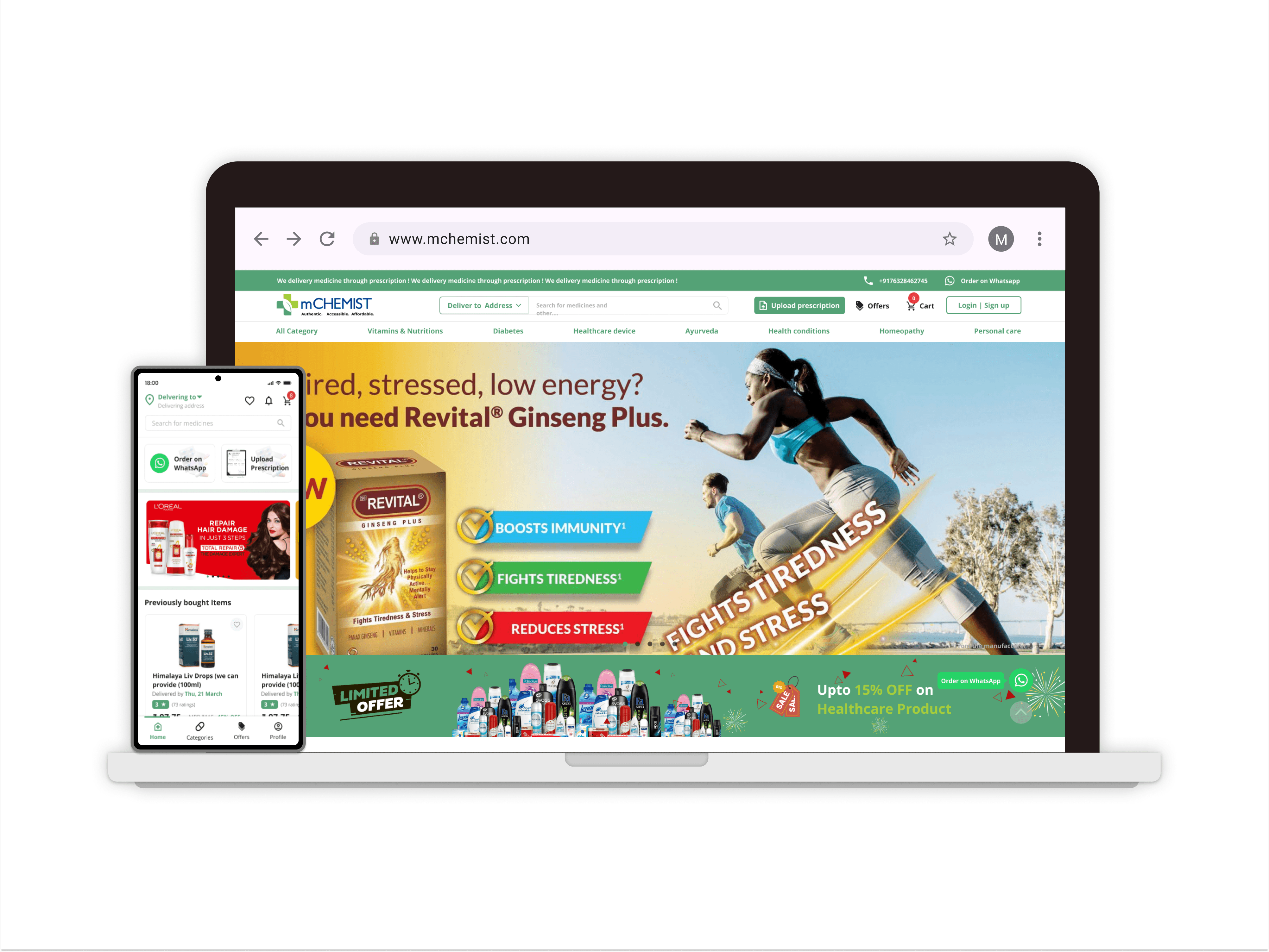
mCHEMIST Website and App
OverView
mCHEMIST is an innovative online pharmacy that aims to make healthcare more accessible and convenient. It provides a comprehensive range of services, including the sale of prescription and over-the-counter medications, healthcare products, and diagnostic services. The platform is designed to cater to the needs of modern consumers who prefer the convenience of online shopping combined with reliable healthcare services.
Timeline
12 weeks
Team
Ashish Sharma (CIO), a team of four engineers, Myself as Product Designer
Tools
Figma, Figjam, Miro, Maze, Google Docs, forms & meet
Transitioning from Zero
There was no design file or written documentation on the design of the website. It was designed by a front-end developer. Initially, it was very challenging for me because I was knew to the IT healthcare industry
At this point, I barely knew what exactly mCHEMIST was, who my stakeholders were, and what exactly was the problem space that I was about to deal with. And so, this meant I was starting pretty much from ground zero. However, the beautiful thing was that I was ready to be curious, ask questions, and get to work.
Q/A for understanding mCHEMIST
- What does mChemist expect from its users to do while on the platform?
- mChemist covers which part of India like towns and cities (doorstep delivery) Is mChemist planning to open a store nearby, or is it a completely online platform for now?
- Do we aim to build a premium version Many users don’t want to consult a doctor (they wish to google and find their answers for the symptoms themselves and later for self-diagnosis [if possible], so are we aiming to provide health articles to the users to get extra interactions?
- Do we have any data for the user feedback online, offline, rating anything else? (What problems users were facing, what features made navigating the platform easy for the users, Were users able to buy medicines or consult the doctor or anything they wanted to do on the platform easily)
What are the pain points of the current product?
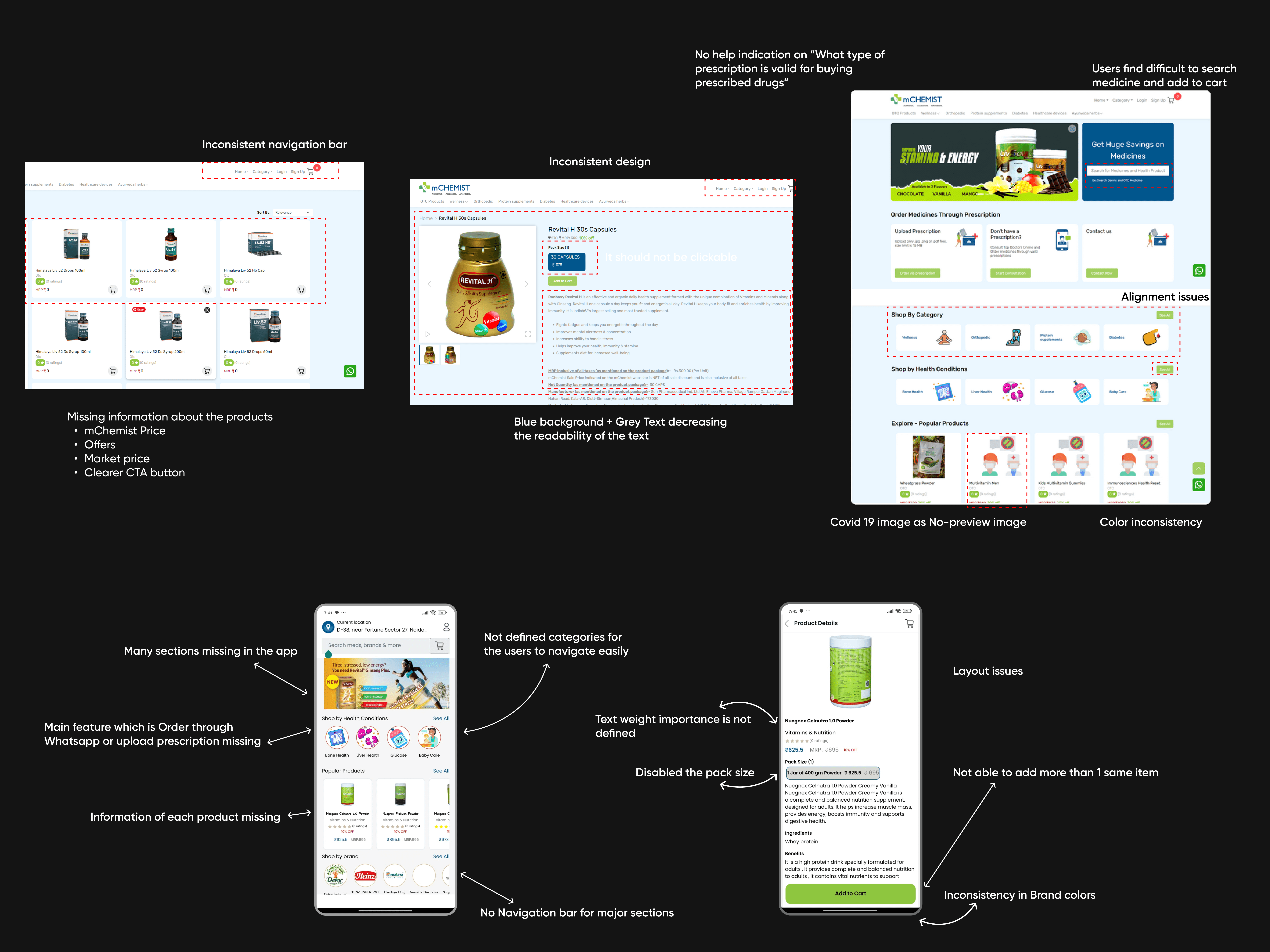
According to stats via Google, this version of the website has an 76% bounce-off rate
Over 70% of users are visiting the site from their mobile devices and the site itself isn’t optimized for the mobile experience
Doesn’t match the rebrand of mCHEMIST’s design system components and the mCHEMIST mobile app
What will success look like?
Increase in % in users buying medicines & Decrease % of users dropping from the site
What need to be solved?
As a service how to provide better engagement & Retention of the customers, Prevent errors & reduce cancellations and Scalable UI
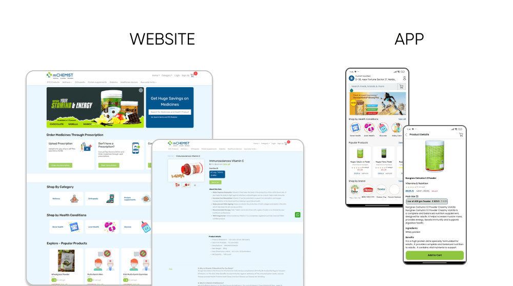
Current Website & App
Summary of Usability Heuristic Evaluation
Help Users Recognize, Diagnose, and Recover from Errors - Error messages are generic and do not provide enough information to help users correct the problem.
Aesthetic and Minimalist Design - Some pages are cluttered with too many elements, making it hard to focus on the primary content.
Flexibility and Efficiency of Use - The site caters well to novice users but lacks advanced features for experienced users (like bulk ordering or quick reorders).
Recognition Rather Than Recall - Users must remember categories or previous searches as there are no visible recent activity or history options.
Error Prevention - Limited checks on input fields, which can lead to errors during the checkout process.
Consistency and Standards - Inconsistent button styles and navigation menus across different sections.
User Control and Freedom - Navigating back from certain pages (like detailed product views) can be cumbersome, often requiring multiple clicks.
Visibility of System Status - Some feedback messages (e.g., item added to cart) are delayed or not prominent enough
Competitve Analysis
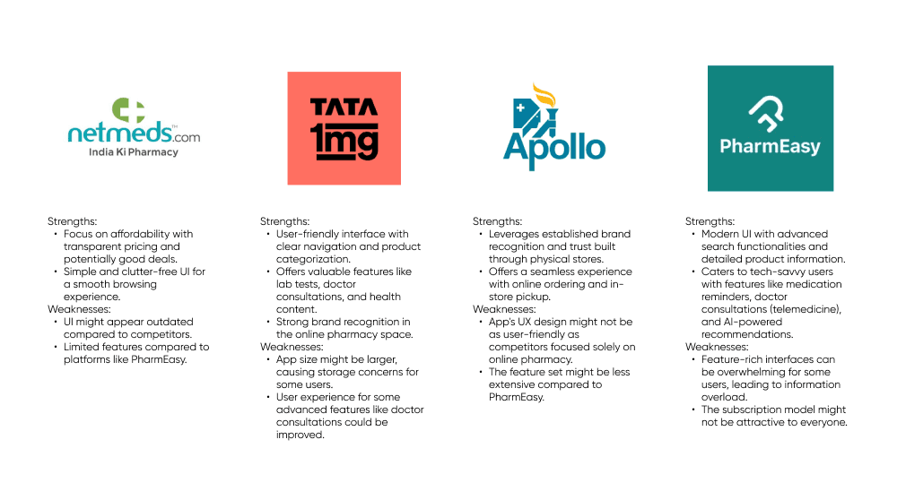
Competitive Analysis of mCHEMIST with TATA1mg, Pharmeasy, Netmeds and Apollo 24/7
User Needs & Pain Points
Brainstorming & User journey Mapping
I collaborated with Ashish (CIO) and the medical team to categorize the OTC (Over-the-counter) medicines. Resulting in 8 categories from 26 categories before.
Information Architecture
Design Decision & Implementation
After finalizing the decisions and low fidelity design, I implemented them in the hifi designs, keeping user-centric design in mind.
Final Presentation
The New Design of the product will be launched as Version 2.O of mCHEMIST soon. Right now it's in the Testing Phase.
For more details, please free to contact me
Major Challenge
First-time experience, Cancel, Reordering & Retention
Helping customer to check out in 3-4 steps maximum without any hassle
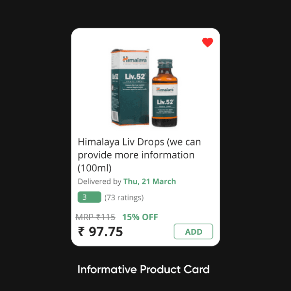
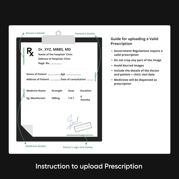
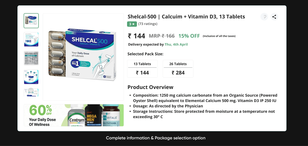
A clear indication of every detail in OTC and Prescribed drugs
Changing customer views and easy buying medicines and get it delivered
